Visualization of Configuration Pushes
This internship project is about a service internal to Google that is
responsible for dynamically pushing pieces of configuration or data to
running processes.
Motivations
The two main questions this project tries to address are:
1. how do the start and end of all pushes in a push def line up against
each other?
2. how does a current push compare against previous pushes?
Terminology
A push definition (push def) describes a particular push. The most
relevant information for this project is that a push def describes how a
push is split in several stages. At Google, the push defs are organized
in a tree hierarchy but, for simplicity, in this project we only used a
flat list of push defs.
Each push for a particular push def is identified by a push handle.
The handle is composed by joining the name for the push def with a push
ID.
For each push there is a push info that describes what happened
during a particular push. This includes information about when the push
started and when the transition from one stage+state to the next
happened.
A push is split in several stages, with each stage updating only
a subset of the consumers. Each stage also has an attempt counter
associated with it because a stage can be retried several times. Each
stage can go through several states before completing.
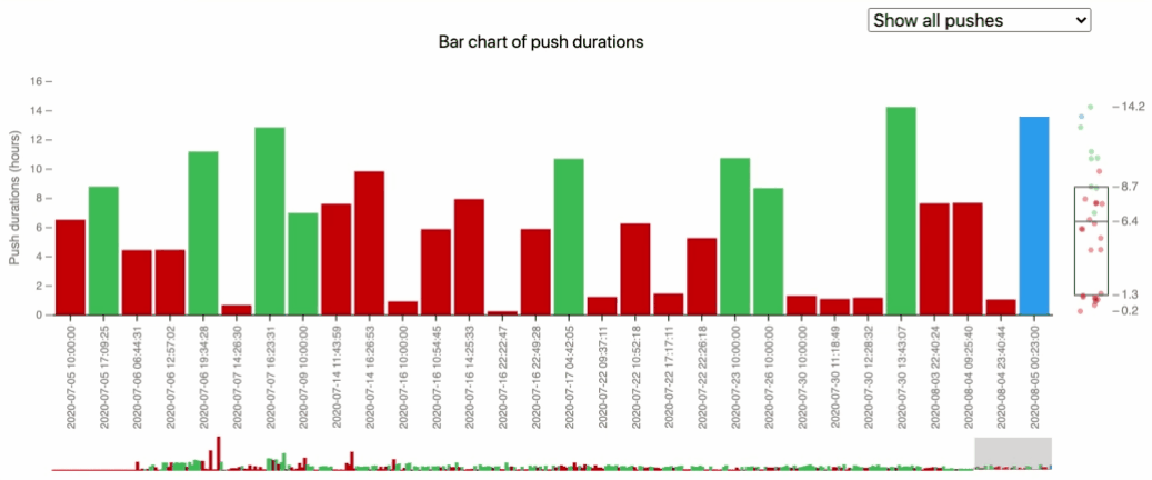
Bar Chart
The bar chart is a visualization element that helps with the second
major question: how does a current push compare against previous pushes,
when the number of pushes is not very large?
The bar chart displays the pushes in chronological order, because the
pushes happened most recently are probably more important to the user.
The y axis of the bar chart is the duration of a single push, with the
most common time unit of the pushes. The bar chart consists of a focus
bar chart, a compressed bar chart with a selector, and a box plot. The
focus bar chart shows a default number of pushes when the user opens the
page.
There are several interactive features integrated in the bar chart. The
user can use the selector to slide among the
bars and select any portion to display. The drop down
menu lets the user to switch between all pushes and completed
pushes. When the user hovers on a bar or the
empty area above it, the bar will be highlighted and a tooltip with the
push's pushID, end state, and start time will appear on top of the bar,
as well as a tag with the duration of the push.
Box Plot
The bar chart also features a box plot that allows the user to compare
the current push duration to the previous pushes and helps the user
predict the completion time of an ongoing push. The box plot contains
five labels that show the minimum, first
quantile(25%), median, third quantile(75%), and maximum duration of the
pushes appeared in the focus bar chart.
When the selector updates the focus bar chart or the
selection of the drop down menu changes, the box plot will be updated
with the new input data. When user hovers over the bar chart, the
corresponding data point in the box plot will be highlighted. The points
in the box plot will switch to a smaller radius to show the distribution
better when there are too many data points.